LIU
A new brand identity design and strategy for an automobile company aimed at a global audience.
This is a design project for creating an identity using personal name, which involves developing a brand strategy, identity assets, visual specifications, and best practices for implementing the identity creatively. Here presents the “Automobile Company - LIU” Design.
View full pdf of three brands

LIU, an automotive company, aims to attract young, dynamic, and motivated individuals who are eager to embrace the future and take on challenges. LIU Motors boasts state-of-the-art electric vehicle technology that blends functionality and sleek design. Users have the option to customize and personalize their vehicles to showcase their independent spirit and creativity. As an innovative international brand, LIU serves customers around the globe.
logo design work-in-progress

For the logo design, I began with geometric shapes and ultimately chose the circle as the primary element. The circle is a visually compelling shape that is perfect for an automotive brand as it represents wheels and tires, and it communicates a sense of clarity and simplicity. The smooth and continuous form of the circle also conveys stability and integrity, which is important for building trust with customers. The use of the circle creates a strong and powerful visual identity for a company in the automotive industry.

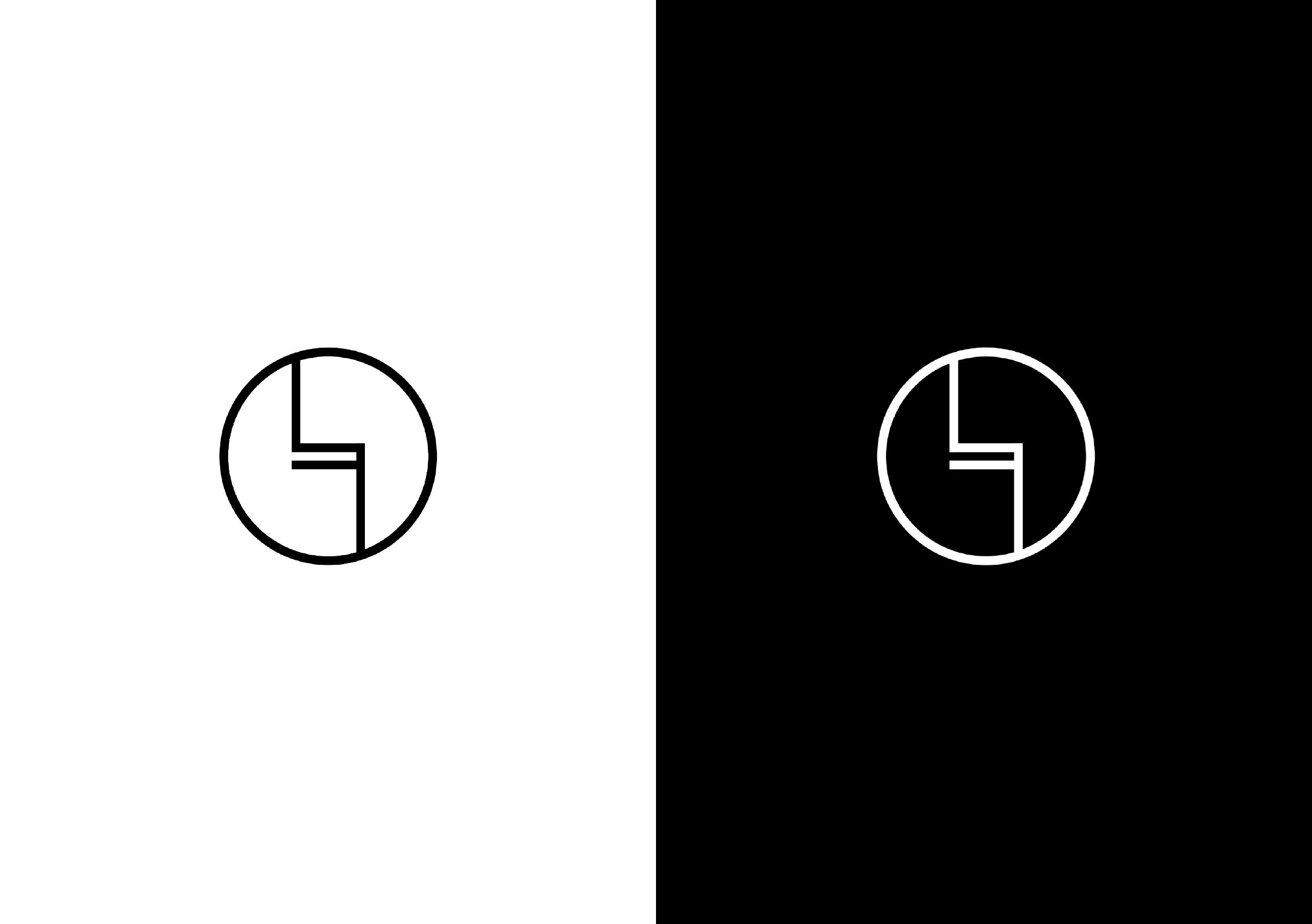
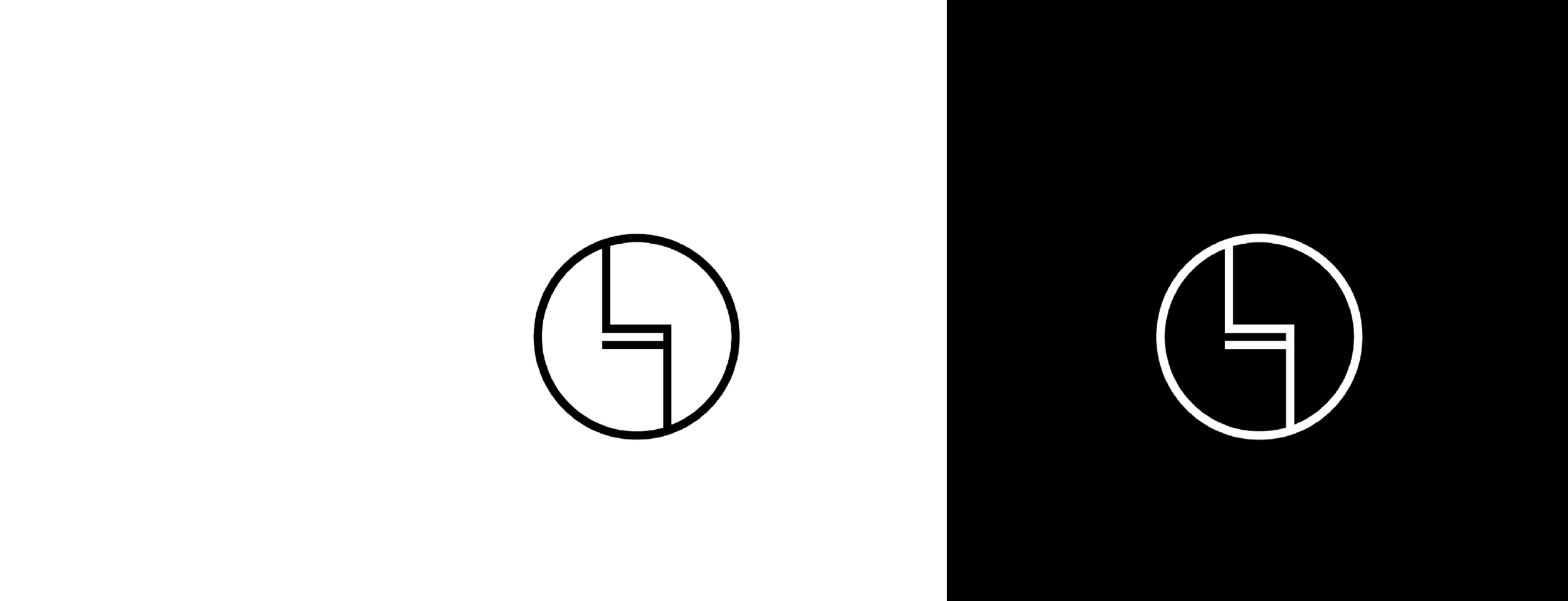
LIU - LOGO
The logo primarily features the brand name letters "LIU" in a perfectly round circle
The lines in the brand name letters "LIU" are connected both above and below, representing the freedom of driving from the ground to the sky and the boundless possibilities that await. This design also symbolizes indomitable strength of spirit and the youthful ambition and vitality that drives us forward. As our cars reflect our personalities, the logo conveys the idea of transcending constraints and taking bold steps towards the future. The symmetrical and asymmetrical elements of the design work together to communicate a sense of unbridled innovation and control over the path ahead.
The lines within the circle are meant to symbolize the road ahead, which includes challenging twists and turns and multiple possible directions. It also resembles a stable and secure saddle shape.