Bhutan
Comprehensive identity design and interactive website design for world’s happiest country - Bhutan
Population: 750,000
Tourists: 133,480
Twitter: Tourism Bhutan 5763 | Bhutan bbs 32.8k
Facebook: 48,576
Tagline: Happiness is a place
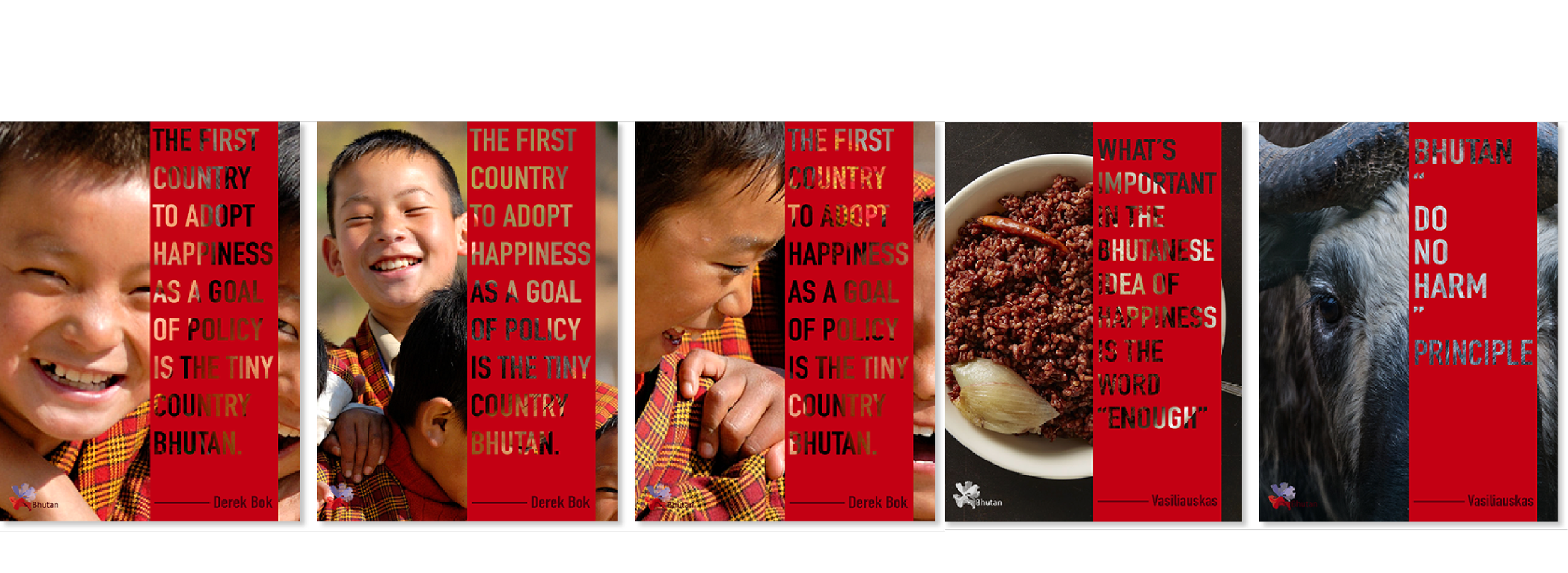
Buzzwords: GNH | Bhutan for life | Do No Harm
Branding Elements: Culture | Natural | People
Bhutan, a Buddhist kingdom on the Himalayas’ eastern edge, is notable for pioneering the concept of gross national happiness. This is a country where the rice is red and where chillies aren't just a seasoning but the main dish. Yet while it visibly protects its Buddhist traditions, Bhutan is not a museum. You will find the Bhutanese well educated, fun loving and well informed about the world around them. It's this blending of the ancient and modern that makes Bhutan endlessly fascinating.
Bhutan possesses unique emotional and philosophical beliefs. The branding identity design of Bhutan serves both outward and inward-facing goals and positioning.


Logo Design
Drawing inspiration from the culture of Bhutan, I combined two identical elements from the image of Bhutan:
National Flower “Blue Poppy”
National Clothing “Gho”
The logo symbolizes the blossoming of Bhutanese spirits.


Packaging & VI Design
The brand personality of Bhutan must be “Happiness”.
The idea of Gross National Happiness was introduced by the fourth king of Bhutan. Bhutanese textiles represent a complex and intricate collection of a distinct art form. It is compulsory for Bhutanese people to wear their national costume.
Clothes: Goh & Kira
Plants: Blue Poppy (Meconopsis Grandis)
Animal: Raven | Takin & Bhutanitis ludlowi
Religion: Buddhism | Hinduism
Symbol: Dragon Flag
Architecture: Paro Taktsang
Food: Red Rice | Milk | Chillis | Goep (Tripe)


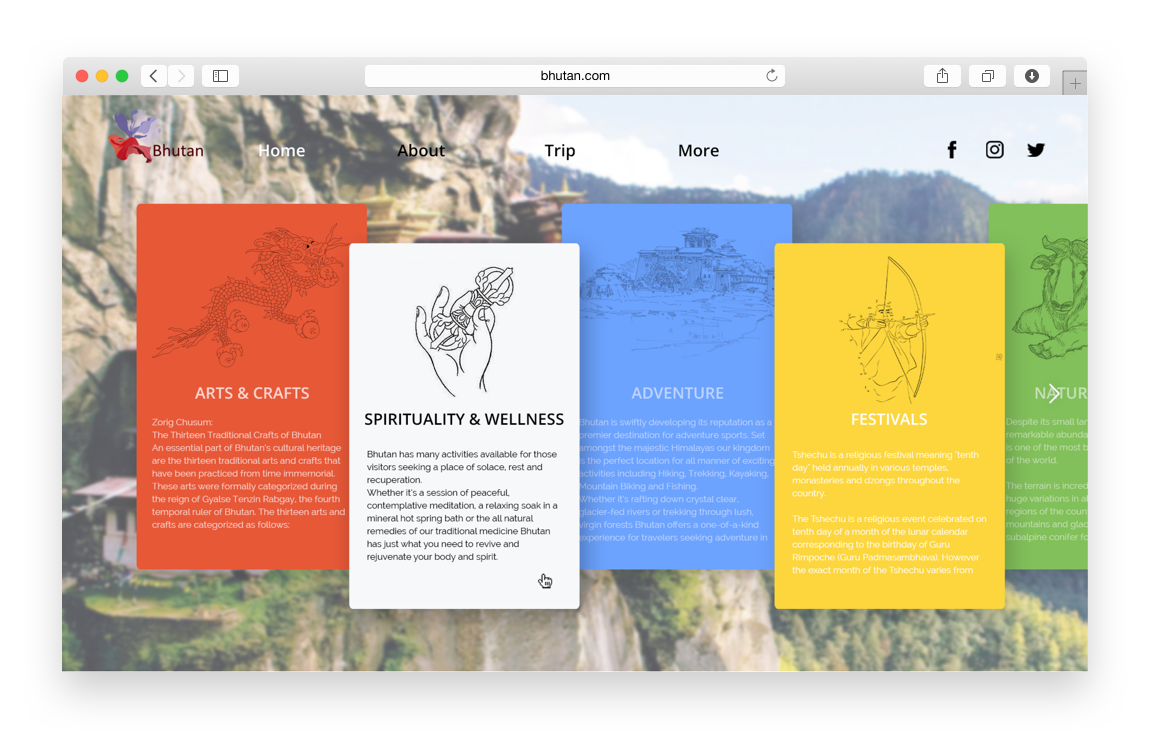
Bhutan Website Design

The vivid and colorful prayer flags fluttering in the wind are a Bhutan symbol. Ubiquitous in Bhutan, these iconic flags can be found everywhere around Bhutan. Infused with religious and cultural significance, these flamboyant red, green, blue, yellow and white flags are my inspiration for the website layout, symbolic of happiness and blessings. The flag cards on the website are introduction pages of Bhutan elements.

Peripheral Design - Bhutan Airlines
By flipping the logo upside down, it transforms into the Bhutan Airlines logo.
With a courteous bowing gesture, Bhutan extends a warm invitation to visit.


